
Built a design system 0→1 for an order management platform serving e-commerce retailers
Logibricks is a B2B SaaS platform running the entire post-purchase lifecycle for online retailers — cataloguing, order management, inventory, warehousing, fulfilment, returns, and payment reconciliation. Seven modules, built over time by different people, all living under one product.
That history was the problem. Each module had quietly grown its own visual language — its own buttons, tables, spacing logic — because nothing forced them to share one. A user moving from order management to returns wasn't using "one product." They were using seven stitched-together ones.
What none of us knew at the start: within a month, this system would stop being a "design quality" project and become load-bearing infrastructure for a company-wide front-end migration. But that comes later.
Role
Owned typography, layouts, components, patterns and design QA
Team
Me + 1 product designer, 4 front-end engineers
Timeline
1 month (alongside active feature work)
Challenge
various distinct visual languages living inside a single product
Logibricks had grown by vertical — each module built out by a different team, at a different time, with whatever patterns felt right at the moment. The result was various distinct visual languages living inside a single product skin.
With a company-wide Angular-to-React migration coming, leadership needed a shared foundation before the rewrite began. The alternative was migrating seven visual languages into a new framework and making the problem permanent.
Inconsistency wasn't cosmetic — it was operational risk.
Logibricks users aren't browsing. They're processing orders and reconciling payments at speed, for hours. When "pending" is one amber in Returns and a different amber in Orders, or a table behaves differently across modules, that's a misread waiting to happen and misreads under time pressure are how operational errors get made.
The cost was real. A new order-management flow took roughly 3 days to design and most of that wasn't problem-solving. It was hunting down UI elements from other libraries, copying existing screens as a starting point.
Engineering felt the same tax from the other side: four front-end devs were maintaining near-duplicate CSS across modules, so a fix in one place never reached anywhere else.
15+
Shades of grey, no defined scale
23+
Text styles at overlapping sizes
7
Button types, with its own logic
Thousands and thousands
lines of custom CSS
Standardization, spacing system
and responsiveness didn’t follow
Planning
Foundations first, so consistency was inherited, not enforced.
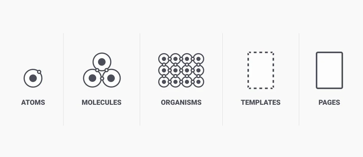
I took an atomic approach: lock typography, color, and spacing before touching any component, so every component would inherit consistency automatically.
My teammate and I split ownership I led typography, layout, and component/pattern architecture; she led the rest of the component library and synced daily.
The constraint that shaped everything, One month, split across other projects. So I sequenced, not scoped.
Both designers and all 4 front-end engineers were splitting time with other active feature work — there was no dedicated month, just a month carved out of an already full one.
So I sequenced: foundations first, then only the components blocking the migration, then everything else in the gaps. We shipped that base to staging early — deliberately incomplete — so the team could validate real screens against real components while bandwidth was still split. The trade-off: working without a finished system for longer than ideal. The payoff: the migration never stalled waiting on Figma.
Key decisions
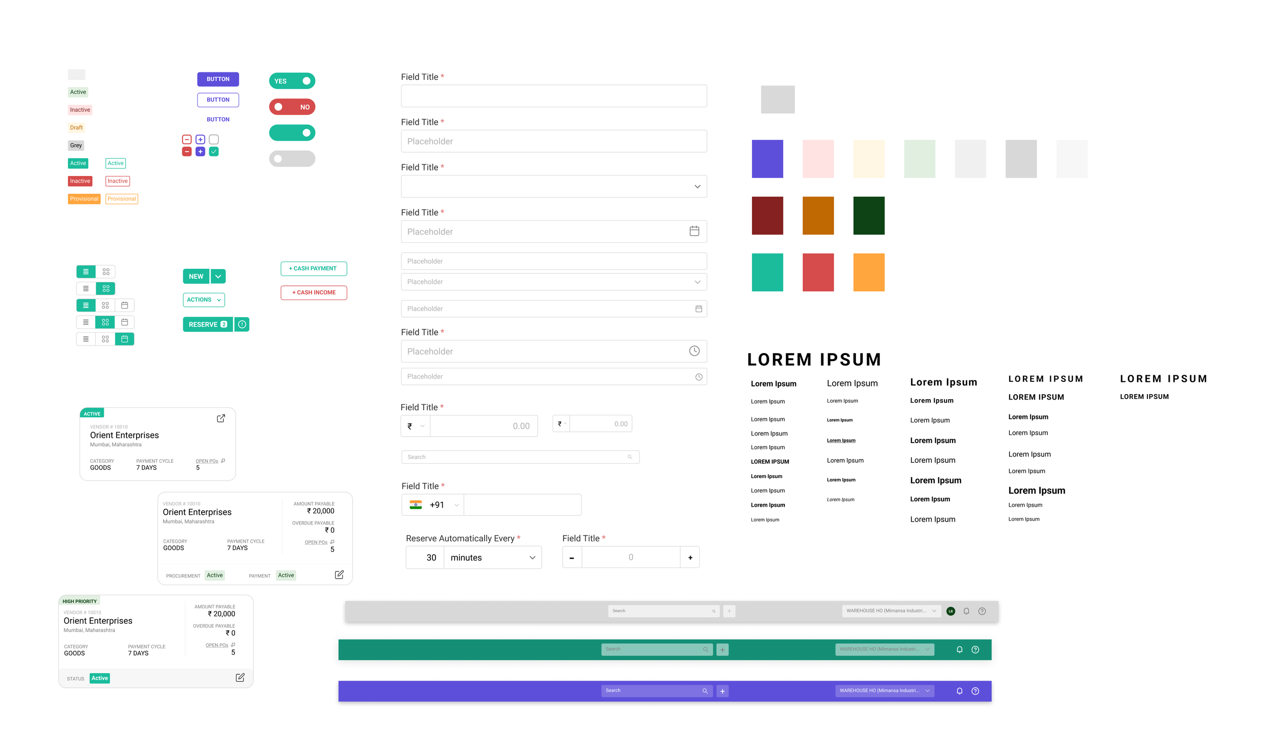
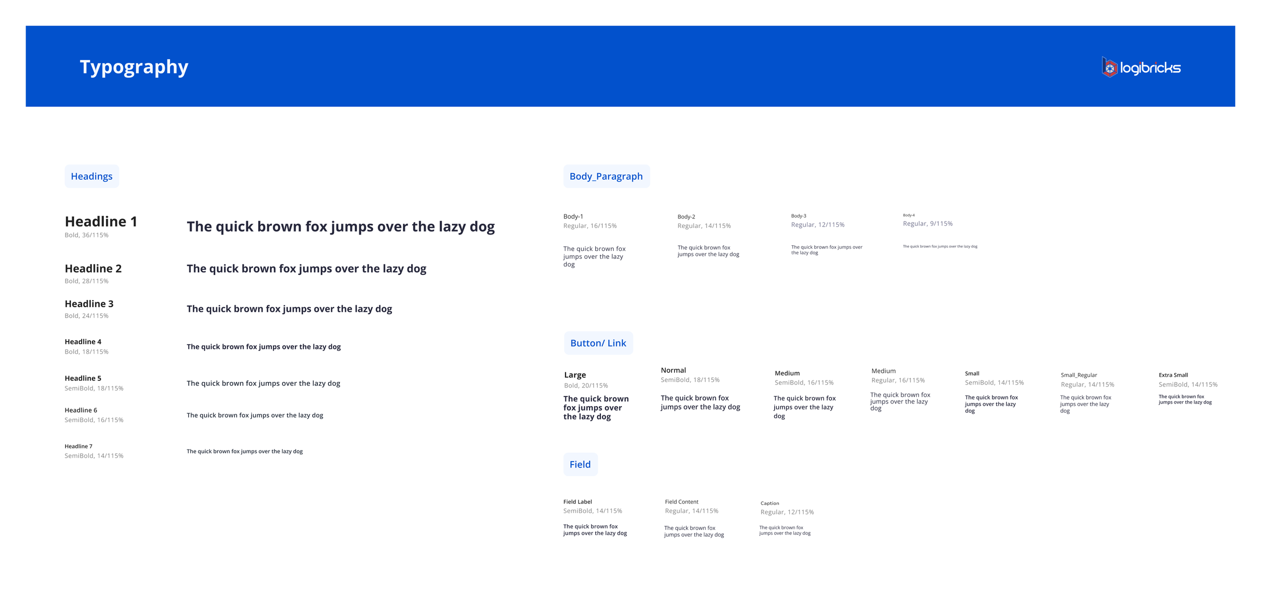
Typography — Open Sans, chosen inside real data tables, not in isolation
A font can look fine as a heading and fall apart in a 12px table cell.
I stress-tested shortlisted typefaces directly inside data-dense screens and across viewport sizes.
Open Sans held its legibility best under both.
2. Component granularity, one master, property-driven variants
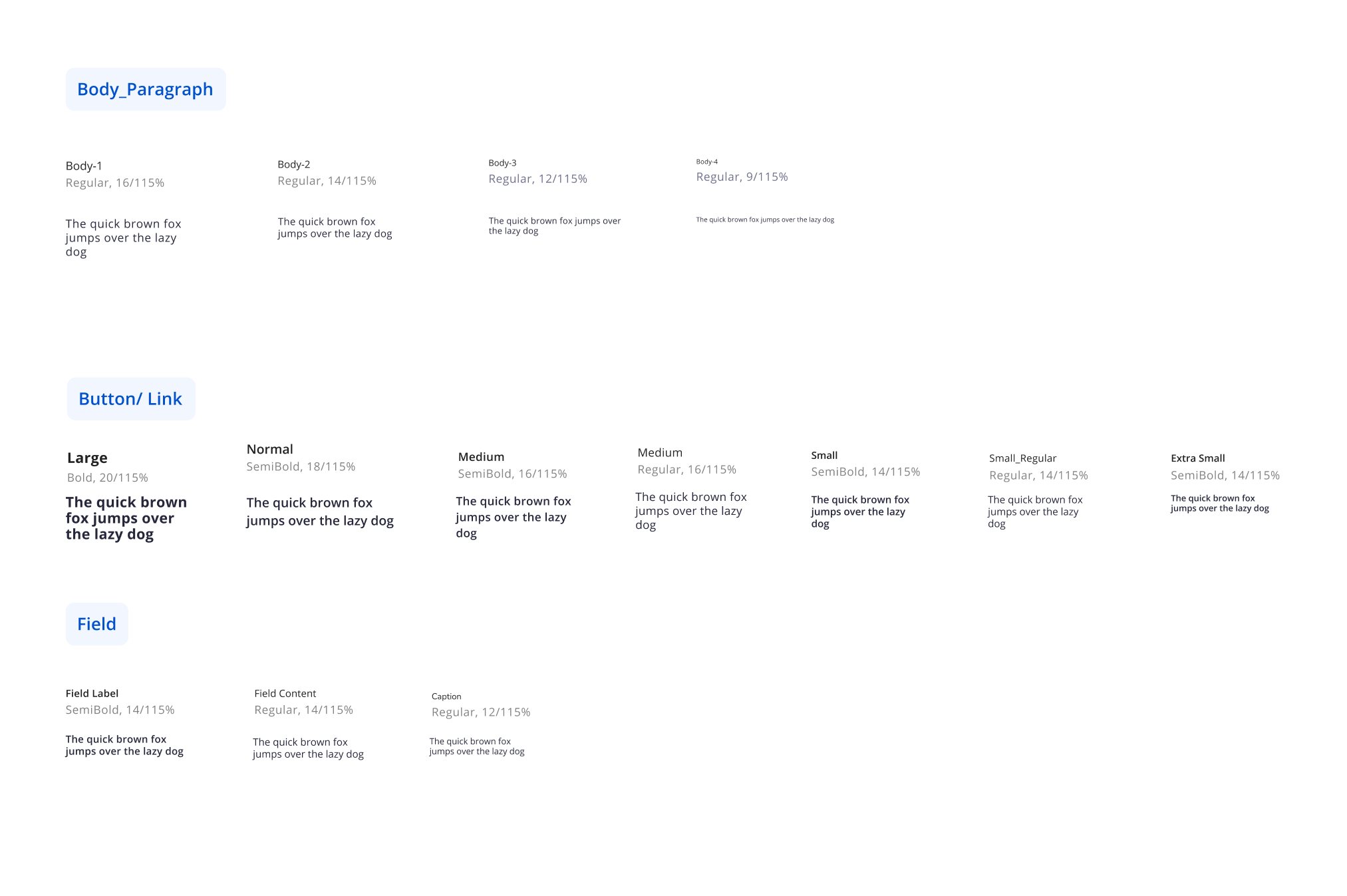
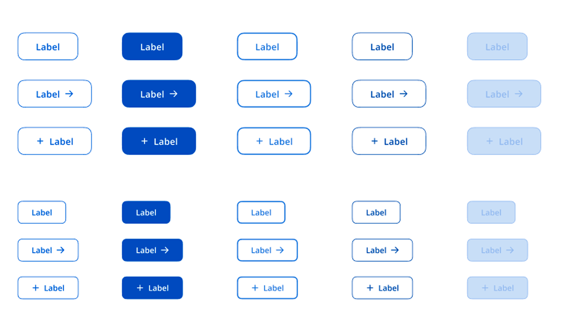
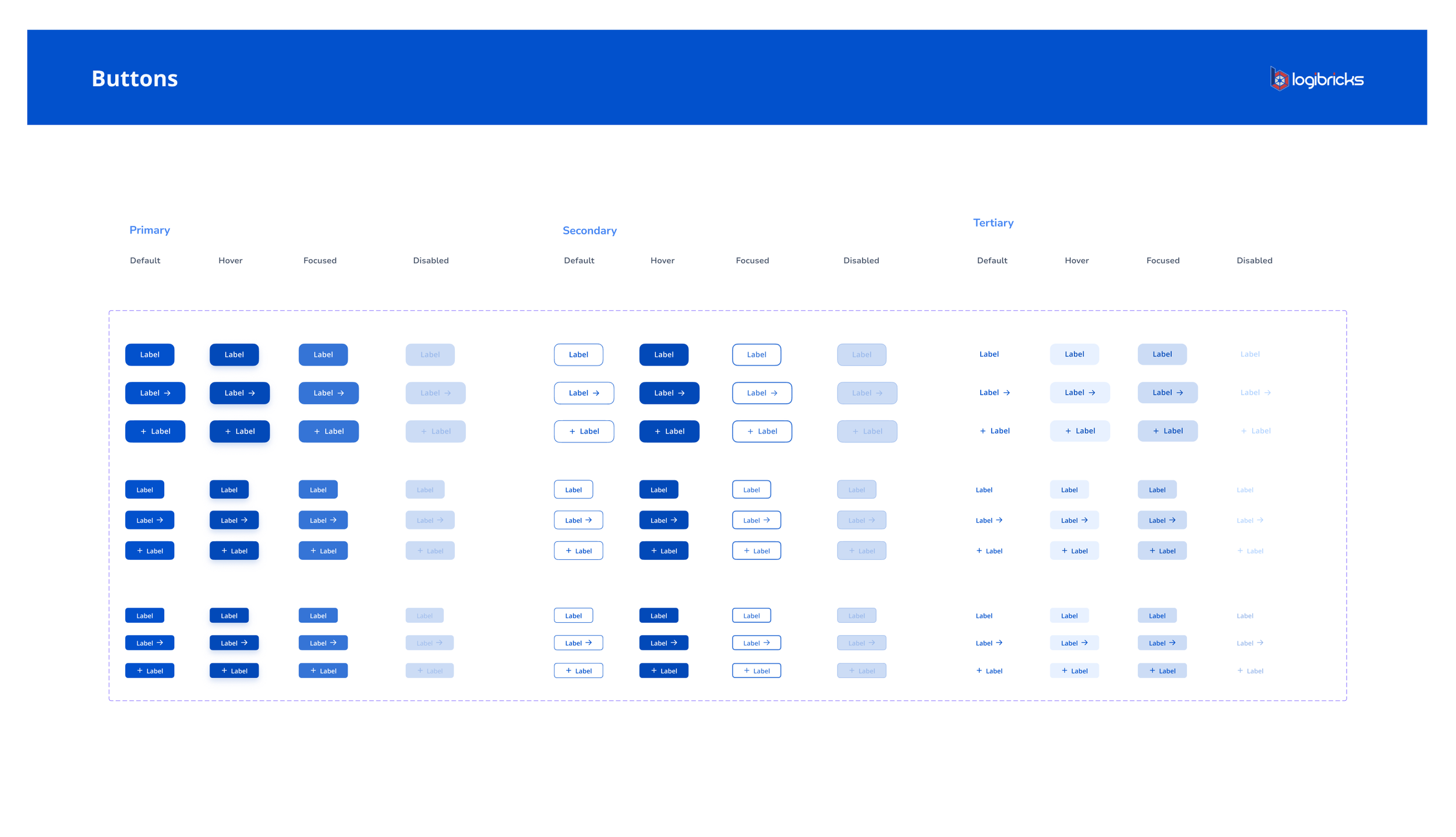
Before: the same "Save" button looked different across modules. I built a single master per pattern with variants controlling type, size, and state ,one source of truth.
This mattered most once component build was split across 4 devs in parallel: everyone implemented from the same defined source, not their own interpretation of a screenshot.
3. Spacing, reduced to one scale
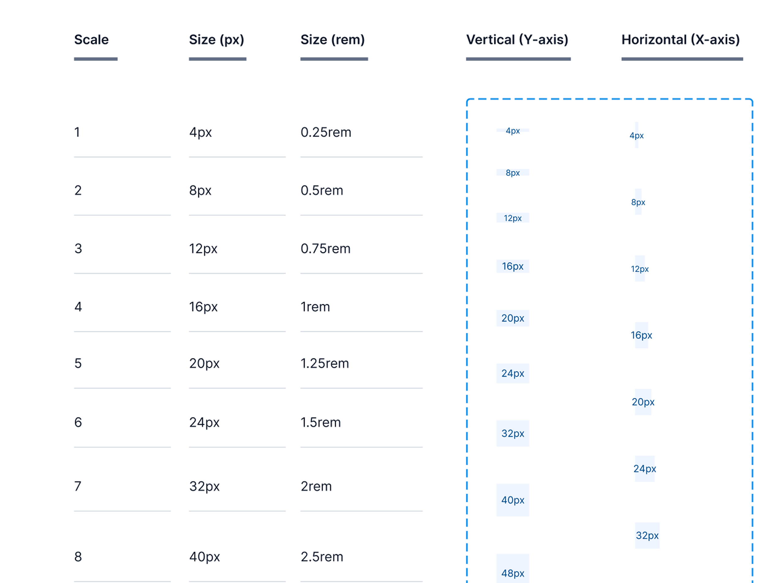
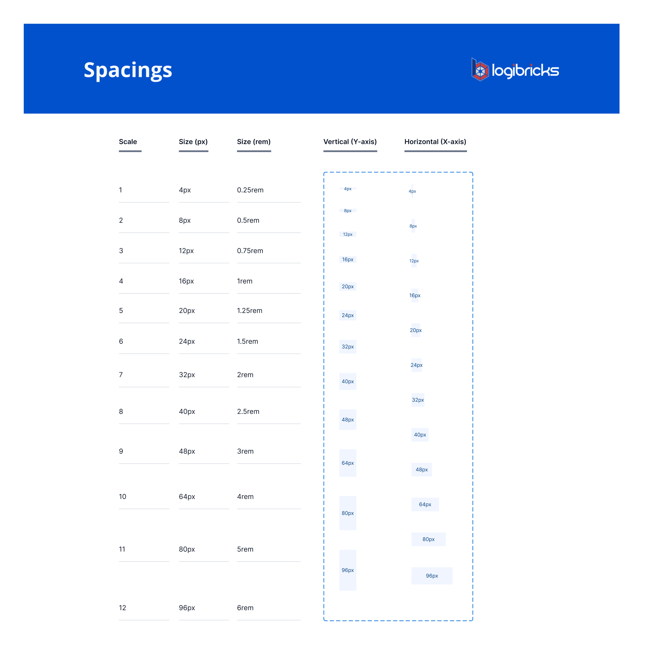
I standardized on a base-4 scale (4, 8, 12, 16, 20, 24, 32... up to 96px), mapped to both px and rem, with separate vertical and horizontal tokens.
A 4px base gives finer control, useful in a data-dense product where table padding often sits between coarser steps.
4. Used atomic design framework
Before locking the approach, I studied how Material Design, Atlassian, and Ant Design structured their systems, not to copy the look, but to check how they scoped tokens and components.
Seeing property-driven master components used consistently across all of them confirmed atomic design (foundations → components) as the right structure over building screen-by-screen.
Foundations
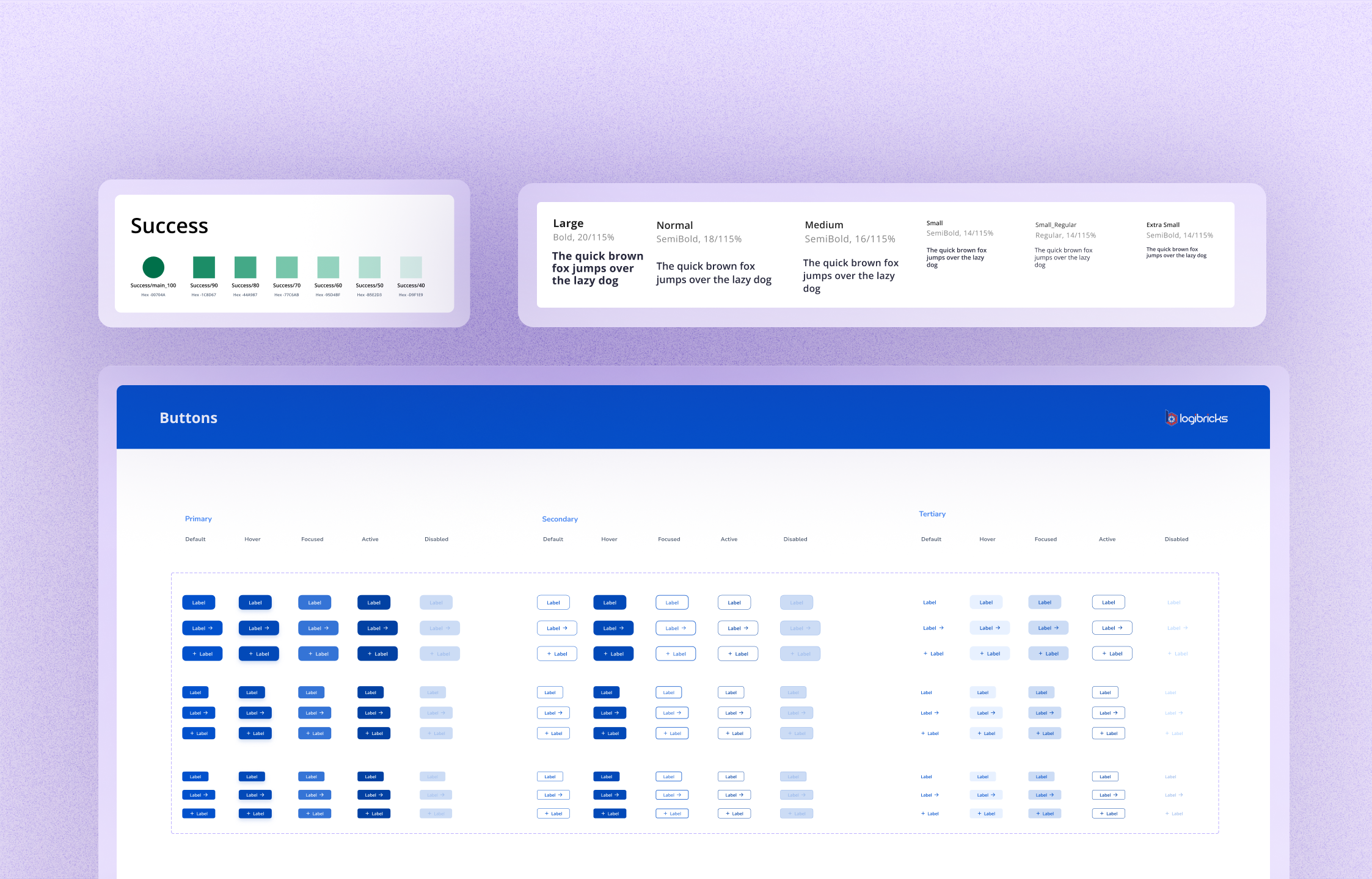
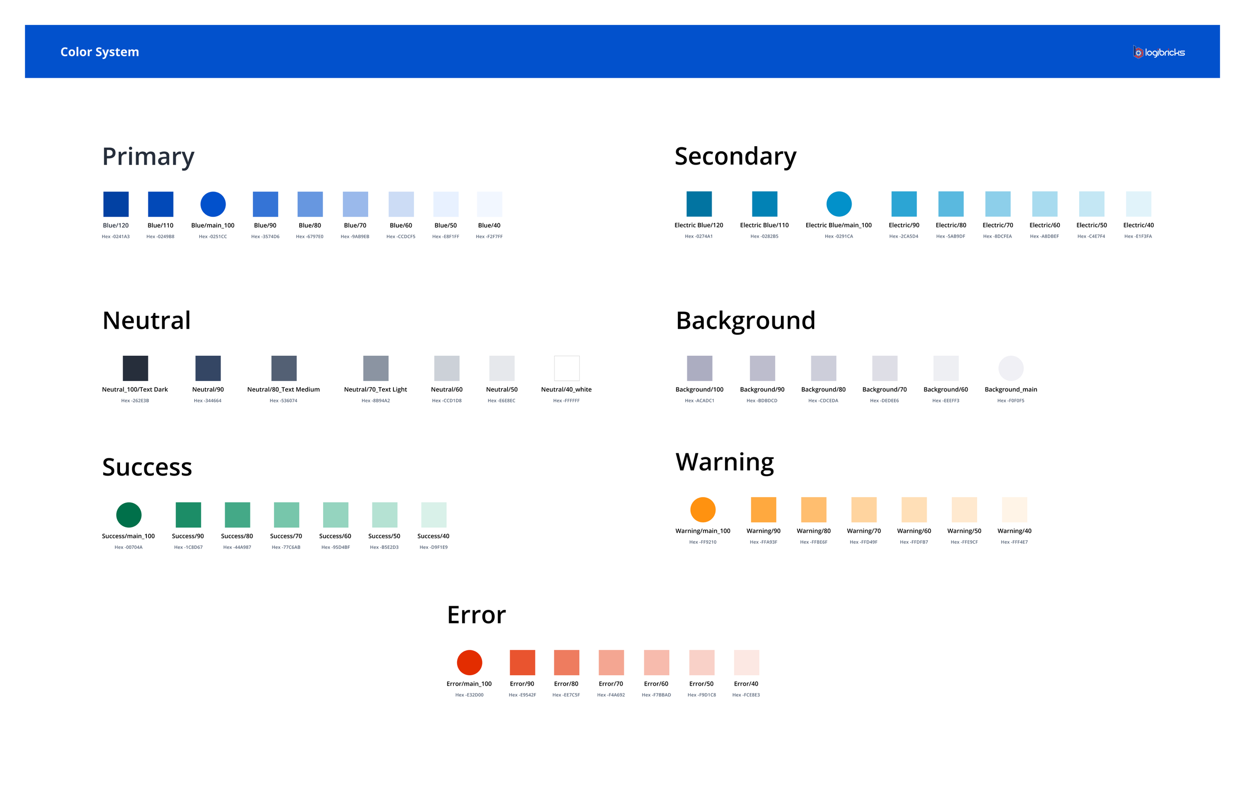
Color, structured by role, not by raw value. Semantic tokens (Primary, Secondary, Success, Warning, Error, Neutral, Background), each with a full tint scale. Status colors were defined once and meant the same thing across all 7 modules.
The system
Typography, tested where it's actually read. Open Sans, stress-tested inside real data tables and across viewport sizes — not judged as a heading on its own. One typeface, one hierarchy, used the same way everywhere.
Spacing, reduced to one scale. A base-4 system (4–96px) with vertical and horizontal tokens, replacing screen-by-screen guesswork. One shared unit of measurement between design and code.
Component creation
Every component shipped with its full state set. Default, hover, focus, filled, error, disabled — designed up front, not retrofitted. In a data-entry-heavy product, unhandled states aren't edge cases; they're Tuesdays.
I also defined usage rules alongside components: destructive actions pair the error-token button with a confirmation step; every data table shares the same row-height and sort pattern across modules. Rules keep a system consistent after handoff, when different people are assembling screens independently.
Accessibility
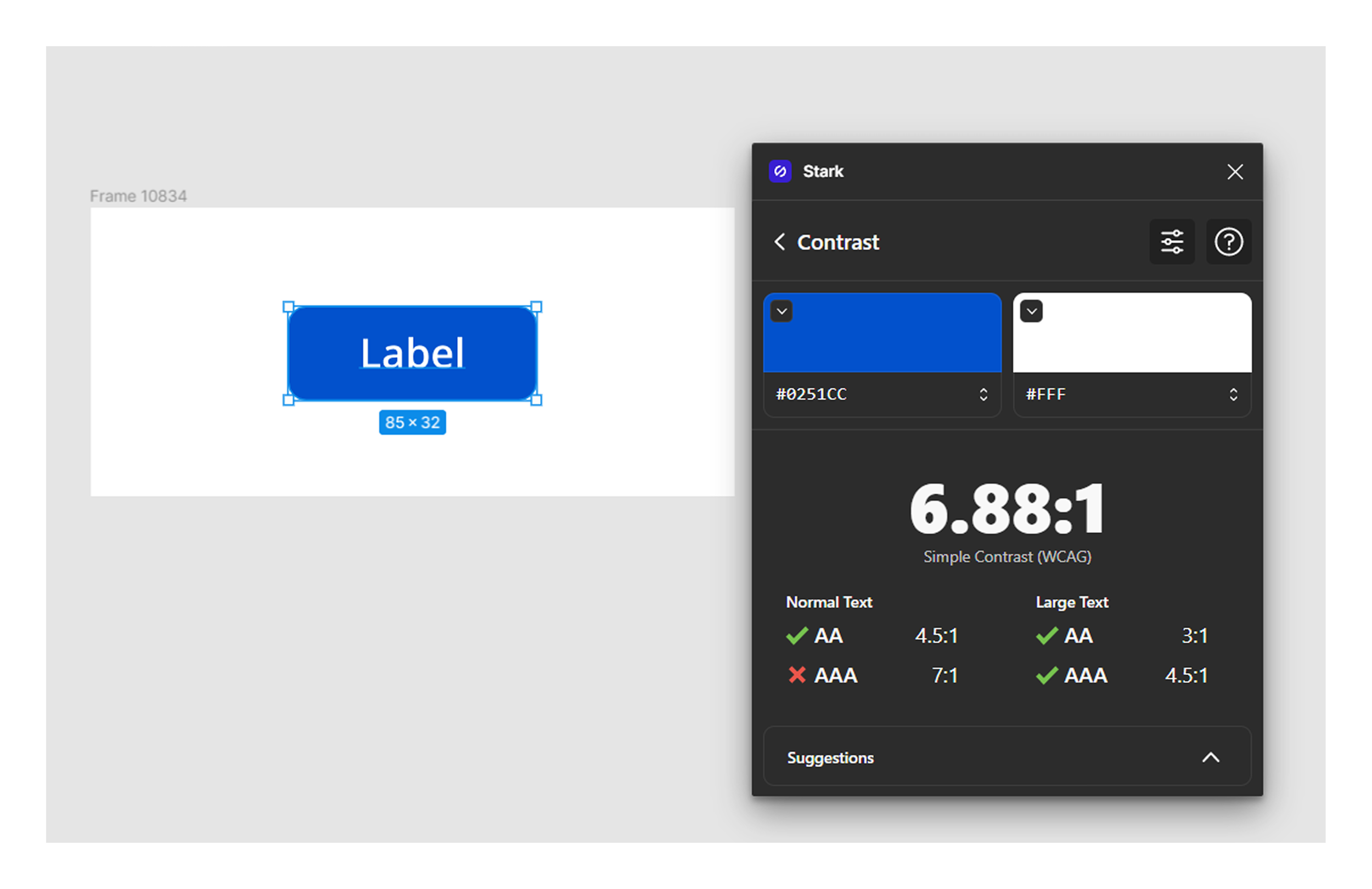
Checked at the foundation layer, not bolted on later. WCAG contrast evaluated before components were finalized — because low-contrast text directly slows scanning and increases errors for staff working long shifts in dense tables.
Documentation
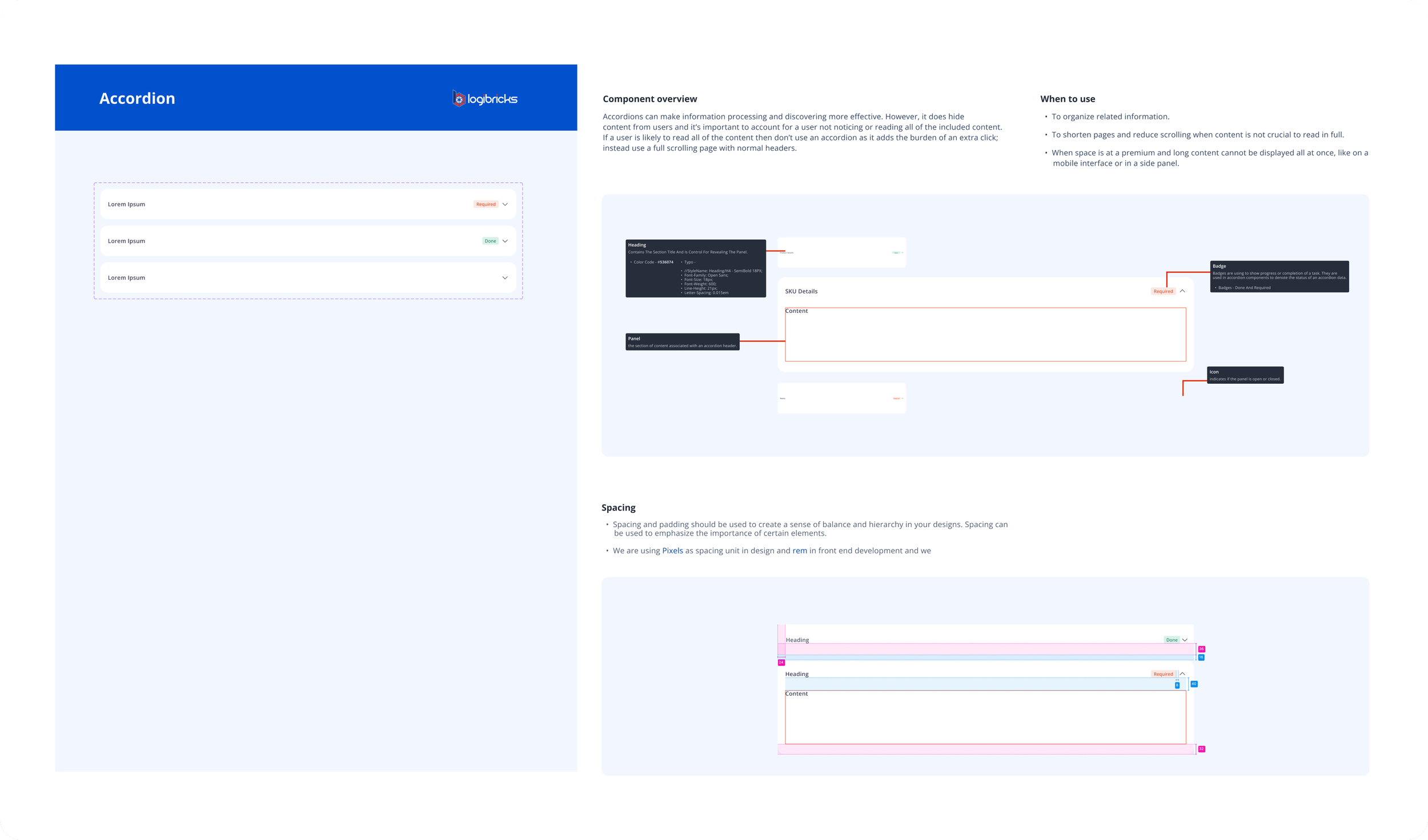
Just enough to answer the two questions people actually had, what does this component do, and what's it called in code. Naming consistency between design and code was the core focus — a dev could go from the design file to the right variant without translating.
Learnings
A system's real test is whether four people building in parallel produce the same result — not how it looks in Figma.
Prioritization is the skill, not completeness — sequencing foundations and critical-path components first is what made the system useful under real constraints.
Timing beats persuasion for adoption — the system landed exactly when engineering needed it, and that did more than any rollout plan could have.
Outcome
The design system became the default path for a company-wide migration.
Logibricks' front-end was split between Angular and React. Around the same time the system shipped, engineering leadership decided to fully migrate onto React. Every module was about to be rebuilt anyway — and the design system gave that rebuild a single, shared source of components instead of recreating UI decisions module by module.
Adoption wasn't gradual. It was immediate.